Thursday, 13 March 2014
Facebook updates its mobile and desktop Sites
Thursday, 6 March 2014
Facebook goes back to basics with latest News Feed redesign
Almost exactly one year ago, Facebook laid out its vision for the future do News Feed. Facebook spent months refining its new design, which touted huge photos, a dynamic navigation bar, and Tumblr-esque profile photos. The company rolled out its new design to a fraction of its billion users, and then called the whole thing off. Users hated the new design. So for its next News Feed, Facebook went back to square one.
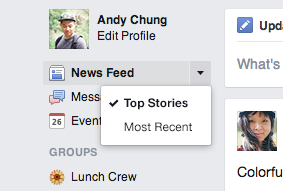
Today the social network is unveiling its latest design for News Feed, which takes learnings from its failed trial and applies them to a familiar but fresh design that it plans to roll out globally over the next few weeks. The new News Feed looks almost exactly like Facebook's mobile News Feed, bearing new iconography, bigger photos, new fonts (Helvetica and Arial), and story cards. The design ditches the prominent drop-down menu of feeds Facebook championed in its designs last March, and sticks them back in the left sidebar. In other words, Facebook's dreams about turning your News Feed into a newspaper of RSS-like feeds are officially over. News feeds like "All Friends," "Groups," and "Photos" have been removed entirely.
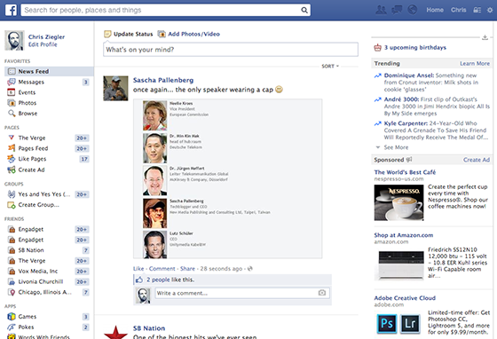
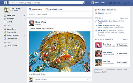 A comparison of Facebook's old (above) and new (below) News Feeds reveals the move to a cleaner look.
"People don't like us moving their furniture around, because you break muscle memory," says News Feed product manager Greg Marra. Facebook's dark-themed sidebar, which collapsed into a strip of icons depending on your screen size, was just too confusing for most users, he says. "That's a particular design idea that looked cool but didn't help you get around the site," Marra says. "You don't need to relearn anything — that was one of our big themes." Facebook has also given up on some of its more complex post types. If a friend commented on a post about a link that two friends shared, indentations — while accurate in terms of attribution — made things look really messy, Marra says. Profile photos have also notably been moved back inside story cards, like in the old News Feed, to limit clutter.
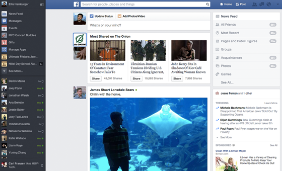 Last year's experimental News Feed redesign didn't go over well with users.
Another noticeable change is that all users will now see a big search bar at the top of their screen. English-speaking Facebook users will see a Graph Search bar, where they can type in queries like "Friends of friends who are single." Non English-speaking Facebook users will see ordinary search results, like people, places, and Pages. Facebook declined to say when its Graph Search feature would roll out to other languages, or to mobile devices.
 Facebook's new News Feed is far from revolutionary, and paints a picture of a company that perhaps can't iterate nearly as quickly as it would like to. It's seemingly not so easy to "move fast and break things" when you have 1.2 billion users. This is ostensibly the reason why Facebook founded Create Labs, a new skunkworks division tasked with building experimental products too progressive for the bulk of its user base. And to that end, Creative Labs' first product — Paper— is definitely a fun and novel approach to News Feed that's far crazier than the company's designs from last year. The web version of News Feed must, after all, cater to the least common denominator across all of Facebook's billion users.
While News Feed doesn't look as "new" as last year's redesign tests looked, Facebook seems to have learned a key lesson: mobile and desktop are not equal. Last March's redesign was pitched as way to create visual parity between the company's desktop and mobile apps. "We recognize that while we strive for design consistency, part of that is recognizing that the way you use things on a PC is different from how you use things on your phone," says Marra, "but it's important that we cut these from the same cloth."
Wednesday, 5 March 2014
Yahoo will Ban Facebook and Google Users from using its Services
Saturday, 22 February 2014
WhatsApp is Down after buyout by Facebook
WhatsApp is currently experiencing an outage. Users around the world are reporting that they can’t send messages, and WhatsApp just confirmed this problems with a tweet stating “sorry we currently experiencing server issues. we hope to be back up and recovered shortly.”
WhatsApp users are flocking to Twitter with memes joking that Facebook is shutting WhatsApp down. In reality, it’s more likely that its $19 billion acquisition by Facebook led to a surge of signups and usage that has overloaded its servers. We’ve contacted Facebook and are awaiting a response.

Uses trying to send messages or check their existing chat conversations, WhatsApp gets stuck, showing an endless loading alert “Connecting…” Reports indicate the outage started as long as two hours ago, and there were some troubles last night as well.

Are you facing a WhatsApp downtime? Then let's go protest in the comments section down below
Friday, 7 February 2014
Facebook now let's you edit your Facebook Movie : Here's How To
Earlier this week, we learned that Facebook would soon let you edit the automatically-generated “Look Back” videos the company had made to celebrate Facebook’s 10th anniversary.
Sure enough: they just launched the editor.
Almost immediately after launch, many users were complaining about the photos that Facebook auto-selected. Some had too many photos of their exes. Some had sad photos that they’d rather not remember as a milestone. One of my friends’ Look Backs prominently featured a picture of a rock, sans explanation or commentary.
A quick visit to the Facebook Lookback page now shows a shiny new edit button.
The editor might not be quite as feature-rich as some might have hoped; you can’t choose ANY Facebook photo to replace those that you don’t like — you can just select from a wider array of pre-picked photos/status updates.
How To Edit Your Look Back:
- Go to the Facebook Lookback page
- Hit the edit button
- Pick your new photos/posts from the pre-populated selections
- Hit the “Update” button at the top of the page
- Wait a few minutes for Facebook to generate your new video.
It’s unclear if the edit feature has been launched to all users, or if it’s being rolled out over time. We’ve checked on around a dozen accounts now, however, and each one had the new button.
Via TechCrunch
Monday, 3 February 2014
Facebook Paper : Review
Mark Zuckerberg has finally done it.
After a long succession of mobile mishaps, he has delivered the portable Facebook app I've always wanted… and there's hardly any evidence that Paper is a Facebook product. Upon opening the app for the first time you're greeted with a shimmering Paper logo set in Helvetica Neue Ultra Light, the opposite of the bold, white logo Facebook has used since 2005. It’s a fresh start, and it could be just what the company needed.
As Facebook reaches 1.25 billion active users and celebrates its tenth anniversary, the company faces increased skepticism from both pundits and consumers. The company is no longer new or cool, they say. Facebook might be too big to fail, but that might also mean it’s too big to make aggressive changes to its service. The company's informal motto, "Move fast and break things," doesn't seem to hold the same gravitas it once held.
So for its next app, Facebook started from scratch and started small. “Great products don’t start with a billion users, they start with just a few,” says Michael Reckhow, product manager on Paper. And it came up with something decidedly unlike anything Facebook’s done before.
Paper is the first product born ofCreative Labs, a new space within Facebook for small teams to develop ideas and apps and see if they stick. To build the app, Zuckerberg enlisted Mike Matas, who designed software for the original iPhone, Nest's trademark thermostat interface, and Al Gore's pioneering interactive eBook Our Choice. His work has cemented touch-based interfaces in the modern vernacular — especially as they pertain to manipulating text and photos on a screen with your fingers.
When Facebook acquired Matas’ digital publishing company Push Pop Press in 2011, it asked him to apply his skills to Facebook content. Paper was initially conceived to make Facebook look better, more like the interactive, always-relevant "personal newspaper" Zuckerberg hoped Facebook would be. Paper turned out a little bit differently: the app abandons Facebook’s singular News Feed in favor of several — each containing a different kind of news. One is your regular old Facebook feed, and you choose the others among 20 categories like Headlines, Planet, Cute, Tech, Pop Life, and Score. Each section includes a stream of stories laid out horizontally inside cards — you swipe left and right to scroll, not up and down as Facebook has trained us all to do.
There's room for more than one News Feed
Paper’s Facebook feed is just a better-looking, more responsive version of what you’ll find inside the company’s main app. Every other section is a mix of recent and popular posts from the profile pages of Facebook's favorite publishers, curated by a small (and powerful) editorial team within the company. In Headlines, for example, you'll find posts from Time, the AP, The New York Times, Politico, and NPR. In Cute, you'll find a range of more curated posts from the likes of Grumpy Cat, Laughing Squid, and Zooey Deschanel's site HelloGiggles.
Curating your News Feed
Facebook doesn’t seem to be actively choosing specific stories as much as it is organizing stories with high engagement from its favorite publishers — but that’s okay. Most of the time, I’m just looking for something to read. Still, I did find myself flipping through story after story from the same publications over and over: TIME, CNN, and The New York Times seem to have received favorable placement in the odds pool. The company emphasizes, however, that it will pull stories from all over the Facebook network, and not just from the 40 publishers it chose to create cards for on launch day. Facebook recently made moves to highlight popular posts inside a new"Trending" section, but never before has the company elevated external content to quite so high a pedestal. With a quick tap and drag, you can arrange it so that Headlines shows up first, and you can push your Facebook feed all the way to the back of your news stack.
Smooth sailing
Everything from swipes to pinch-and-zooms respond instantaneously and naturally, and images load quickly. For help with Paper's myriad animations and transitions, Matas called upon Loren Brichter, a former colleague at Apple who is best-known for his work on Tweetie and Letterpress. Ironically, Paper has all but ignored pull-to-refresh, a gesture Brichter invented, but in its place the duo have created a host of new gestures and ideas that will very likely inspire the next generation of interactive apps.
FACEBOOK’S MAIN APP FEELS ANCIENT IN COMPARISON
Paper actually includes no refresh button, which could confuse some users, but is for the better. New content cards fly in the moment they’re posted, as if they’re being dealt at a casino. Posts unfold like a broadsheet newspaper when you tap them. As you rearrange news sections, each section card shivers like a leaf floating atop your screen. If you tap Reshare on a post, it shrinks into a small box and the words "Ellis Hamburger shared this" appear letter by letter as if it they being typed on a typewriter. The card then flies off the screen like a message sent in Apple’s Mail app for iPad. Paper even killed off the back button, and has replaced it with a simple down-swipe to return to the previous page.
These interactions, while sometimes a tad too whimsical, make Facebook’s main app feel ancient in comparison. And with the ability to view Timelines, Groups, and Events, as well as your friend requests, messages, and notifications — in far more elegant fashion than the company’s main app — it can effectively replace the standard app. In my week of testing, I found no reason to return to the Facebook app.
Wrap-Up
THE BEST MOBILE FACEBOOK EXPERIENCE YET
After using Paper for several hours, I waved a fond goodbye to the blue F that has adorned my phone's home screen for the last several years. I replaced it with Paper, a more useful app, and the best version of Facebook yet.
The more I think about it, though, the more I think that “a better Facebook” might not be what Facebook users are looking for. Consumers are asking for a fun, addictive new way to interact with friends — as indicated by the rise of apps like Snapchat and Secret, and games like QuizUp. Investors are asking for Facebook’s answer to teens allegedly fleeing the service. Pundits, of course, just want to know how Facebook will survive when it's features are being unbundled by smaller, more agile startups at every turn.
Creative Labs is ostensibly the answer to these questions, giving Facebook the ability to make small, experimental moves too risky to thrust upon 1.25 billion people simultaneously. Some say Facebook may have an “irreversibly bad brand,”and no amount of wonderful gestures and interfaces can fix that. Fortunately, Paper is more than just a new interface — it’s a potent response to the dozens of news apps taking hold in the App Store.
Maybe Creative Labs’ next app will answer our questions about where Facebook fits in in a growing world of ephemeral apps and experiences.
ITECHNOBLOG SCORE
8.5 - Very Good software but may need some improvements
Disclaimer
This publication has been reposted by the permission of its owner.
(Image Credit : the verge)
Thursday, 30 January 2014
Facebook introduces Paper, It will make you forget your Facebook app
This morning, Facebook is announcing a new standalone iPhone app called Paper. Contrary to earlier rumors, it's much more than just a news-reading app — it's a complete reimagining of Facebook itself. Once you've used it, you may never want to open the standard Facebook app again. It may not replicated every feature of Facebook's main app, but it does fulfill the majority of people's needs. Simply put, it's much, much better.
Paper takes the standard Facebook News Feed and recreates it as an immersive, horizontally scrolling set of screens. It also provides a new way to post to Facebook (and Paper) with an elegant WYSIWYG editor that borrows the styling of Medium's andSvbltle's blogging systems. Finally, yes, it's a news-reading app that owes some of its looks to Flipboard. It will be available for the iPhone in the US (and only the iPhone in the US) on February 3rd. It's also ad-free, at least for now.
That's all more than we were expecting when we sat down with product designer Mike Matas and product manager Michael Reckhow. Neither would quite take the bait when asked whether this should serve as a replacement for the original Facebook app (or, as I put it during our interview, a virtual indictment). Reckhow says that there are "tools that were out there for sharing high-quality stuff and also the tools where you could reach an audience," but that too often they aren't the same thing. "We felt you shouldn't have to choose between one or the other," he says.
Goodbye buttons, hello swipes
Paper cuts away virtually all buttons and other UI elements to make every status update, photo, and news story appear full-screen. To get around, you will need to learn a basic set of gestures, but the app will gently remind you what they are if it thinks you're stuck. Wide photos pan as you tilt the phone (the team cheekily calls it the "Ken turns" effect), UI elements often just fade away, and news stories are presented in Twitter-esque cards.
The lack of chrome to help place you in the app and tell you how to navigate can be a little disorienting. On the bright side, the UI is fast and fluid, thanks to the nine months the team has spent working on the app. Loren Brichter, the creator ofLetterpress and Tweetie, also chipped in on the coding. The result is an app that shares a family resemblance to Facebook Home on Android, but is much faster and more full-featured.
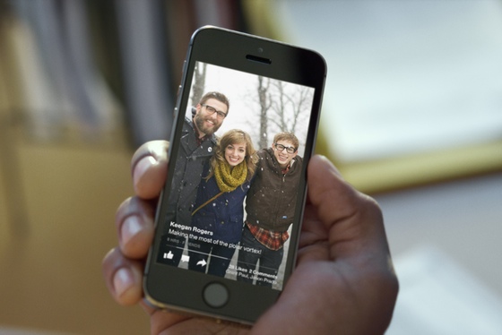
Each section in Paper has a main screen with a cover photo and a list of small cards at the bottom. You can scroll through or drill into the cards, at which point you'll be swiping through one card at a time. Matas hopes that you'll flip through slowly. "You really want people to spend a little bit of time with it and appreciate that content," Matas says, "almost like when you go to a museum and you spend a little bit of time with each thing."
A lean-back experience, but on a tiny screen
If you aren't put off by the idea of considering a photo of your friend's dog an art piece, you might call it a lean-back experience (albeit on a tiny screen). As a UI philosophy, this stands in direct opposition to the high-volume, high-noise vertical feeds we're used to on Twitter and Facebook. It definitely means it will take longer to grind through content like you can on Twitter — but for Facebook, that's exactly the point. If, like me, you're a news addict and an information fiend, Paper may be a little too relaxed for you.
The interface for news reading is exactly the same, with the exception that links are automatically turned into small, Twitter-esque media cards with branding from the publication. Swiping up to read the full story takes you to the source site — there's no offline mode like you might find in a more full featured news app. You also can't add any site you want, as with a traditional RSS reader. Instead, Facebook has hired a team of content curators to pick stories for you in one of a dozen or so categories ranging from basic news to cute animals.
You can post to Paper (and thus Facebook) in a new kind of compose screen. It shows you exactly what the final post will look like, and Reckhow isn't shy about his hope that people will think of Paper as a new kind of thing — even though the plumbing underneath is still Facebook. "Think about when Instagram came out and you now had this new way to share," he says. Facebook’s ambition with Paper is to have it become its own thing, not just a different way of accessing Facebook. Matas goes so far as to say that "it’s a publishing tool, a way of publishing great content, and a way of viewing great content."
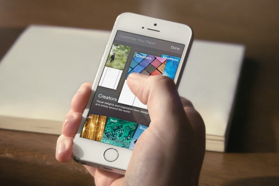
Paper is the first product to come out of Facebook Creative Labs, a unit within the company tasked to "innovate and build new things," as Reckhow puts it. That's likely a sign that Paper will be just one of what CEO Mark Zuckerberg called "new and engaging types of mobile experiences" on yesterday’s earnings call. Since its embarrassing Snapchat clone called Poke failed, Facebook seems closer to figuring out the right formula for its single-use apps. Facebook knows that mobile users are gravitating towards such apps, and it intends to create more of them.
Facebook wants another spot on your home screen, and another one after that
That’s probably a good thing, and perhaps a necessary one. From a user's perspective, Facebook’s current app is beset by dozens of options, nooks, crannies, and features that most people don’t really use. The recent "tab-centric"redesign helped simplify things, but it wasn’t radical change. Facebook has a billion users, and so any alterations it wants to make to its core app need to be tested — extensively. That kind of testing can get in the way of creative design. "You can’t be innovative if you’re encumbered by worrying if you’re going to disrupt what hundreds of millions or a billion people are doing," Reckhow says.
The team wanted "to have the creative freedom to go outside of what we’ve done and not worry about if it’s going to impact metrics [on] day one." For Reckhow, Matas, and the rest of the team, Paper is less a replacement for Facebook’s app than a chance for the company to try out something very different from what it’s done before — and get another icon on your iPhone’s home screen in the process.
If Paper does score a slot on your main home screen, another app will probably have to be buried away somewhere else. For a lot of people, Facebook itself will be a prime candidate.


